‘Mobilegeddon’ – Google’s initiative to reward mobile optimised websites with better search engine rankings for searches coming from a mobile device – came and went in April 2015, but Australian businesses were a little slow to react. Around the same time as Google implemented the new rules, it was reported that 70% of the top 1,000 websites in Australia were not mobile optimised (source). At the time, 56% of Australians accessed the internet at least as often via smartphone as they did via a computer. Skip forward to 2016 and that figure’s now 63% (source). It all makes for a highly compelling argument that your website should be mobile optimised, and we’re definitely not about to tell you not to do that – however, it’s not a silver bullet to engagement with mobile users.
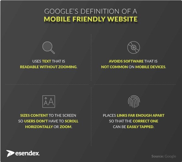
Here’s Google’s definition of a mobile-friendly website:
![Definition of mobile friendly websites]()
It’s all about providing a better user experience for people accessing websites on a mobile, but what’s interesting is that further research has shown that simply making your website mobile-friendly doesn’t mean you’re going to enjoy higher conversion rates from mobile users.
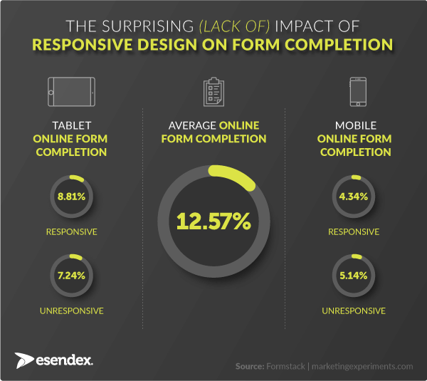
By conversion rates I mean the likelihood that someone’s going to complete a form, register for a service, make a purchase etc. This case study illustrated that the impact of responsive (mobile friendly) design on a tablet is negligible, and on a mobile, it’s actually worse.![Form conversion on mobile]() Additional analysis from the recruitment industry revealed that 8% of candidates accessing a job application form on a desktop will complete it, but that drops to 1.5% when accessed via a mobile.*Why aren’t Google’s guidelines going far enough to make completing a form on a mobile as likely as a desktop? The researchers concluded that not enough thought is going into reducing friction – the ease of completion – or building trust. Conversion rate optimisation is not a new discipline but there’s not much out there which tackles mobile devices. We’ve put together our top tips for improving your chances of getting a customer from A to B on their mobile.
Additional analysis from the recruitment industry revealed that 8% of candidates accessing a job application form on a desktop will complete it, but that drops to 1.5% when accessed via a mobile.*Why aren’t Google’s guidelines going far enough to make completing a form on a mobile as likely as a desktop? The researchers concluded that not enough thought is going into reducing friction – the ease of completion – or building trust. Conversion rate optimisation is not a new discipline but there’s not much out there which tackles mobile devices. We’ve put together our top tips for improving your chances of getting a customer from A to B on their mobile.
Optimising your mobile forms
![1]() Avoid distractions. Remove anything that’s not absolutely necessary to the customer experience to create both a better aesthetic and keep users focused on the goal.
Avoid distractions. Remove anything that’s not absolutely necessary to the customer experience to create both a better aesthetic and keep users focused on the goal.
![2]() Use adaptive error messages that appear immediately when a field has been completed incorrectly, rather than when you’ve clicked submit. They should clearly illustrate how to correct the error, too.
Use adaptive error messages that appear immediately when a field has been completed incorrectly, rather than when you’ve clicked submit. They should clearly illustrate how to correct the error, too.
![3]() Depending on the nature of the form, pre-populate fields. So for example, if you have initiated the access of the form by providing a personalised link in an SMS or email, you could hide or pre-fill any fields with information you already have about the customer.
Depending on the nature of the form, pre-populate fields. So for example, if you have initiated the access of the form by providing a personalised link in an SMS or email, you could hide or pre-fill any fields with information you already have about the customer.
![4]() Remove any fields that aren’t absolutely necessary (as a rule of thumb, shorter forms are more likely to be completed), and if it’s not obvious, explain why you’re asking for the information to build confidence with the user.
Remove any fields that aren’t absolutely necessary (as a rule of thumb, shorter forms are more likely to be completed), and if it’s not obvious, explain why you’re asking for the information to build confidence with the user.
![5]() Drop down menus don’t lend themselves to mobile forms. Exchange these for radio buttons, sliders or steppers that allow you to change a number or date by increments. Our new Mobile Journeys platform was designed with mobile form completion in mind, and we’ve seen average click-to-completion rates of 46.5%. Try a Mobile Journey out here.*Sources: Eremedia | Esendex UK customer data
Drop down menus don’t lend themselves to mobile forms. Exchange these for radio buttons, sliders or steppers that allow you to change a number or date by increments. Our new Mobile Journeys platform was designed with mobile form completion in mind, and we’ve seen average click-to-completion rates of 46.5%. Try a Mobile Journey out here.*Sources: Eremedia | Esendex UK customer data


